Choosing the details-week three of the one room challenge
Hello Everyone! Thank you for stopping by. If you’ve been following along we have made it to week three of the Spring 2019 One Room Challenge. WAHOO!! If you are new here let’s catch you up. The One Room challenge or ORC is a design challenge hosted by Linda @callingithome where bloggers are challenged to transform a space in 6 weeks and blog about it along the way. Thank you Linda for hosting such an amazing group and Better Homes and Gardens for being the media sponsor.
For this Spring challenge I have chosen to refresh our kitchen space at the lake house. As a reminder we have six short weeks to complete our kitchen (and in our case its only weekends since we actually live an hour and a half away!). As I mentioned this is my third challenge. You can see my mudroom here and guest room here. It seriously is the only way we seem to get a room completely finished, but each time about midway through the six weeks my husband turns and looks at me as if I’ve lost my mind. And yet I can’t help myself! I love this community of bloggers, the supportive atmosphere and of course I can’t resist a challenge!
If you've missed anything catch up with my weekly progress here:
week1/week2 This week has been all about pulling things together. Partly because we are at a standstill with both the counters and the tiling (more about that next week). So I moved on to selecting the pretty details like paint, wallpaper, blinds and cabinet hardware that give a room texture (my favorite) and help to make it feel finished.
Up first. I really want to add some color to this wall in the dining space. I chose a wall mural in greys, blues and greens which feels right for the house.
We will be adding wallpaper to the dining area.
I chose this pretty mural which I will attempt to hang this weekend. Wish me luck.
Wallpaper Mural
I am still looking for blinds for the window in the breakfast nook.
Breakfast nook
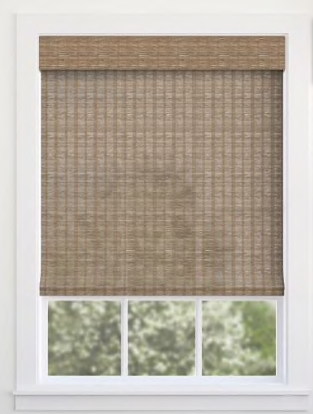
I believe these are the original blinds from when the house was built in 2004. They really need to be updated. I’m leaning towards woven blinds. I have a couple of choices that are in contention.
I like the texture on this one.
I’m also thinking about painting the back of the shelves in the nook. Or maybe a fun wallpaper? I think it may be really a bit above my skill level to get paper up to the top of the ceiling. We shall see.
The sink came in this week. It’s ginormous. But I love the single bowl.
Until next time,
-Libbie


