Painting a Graphic wall in a Home Office /One week Challenge Week four
Hello!
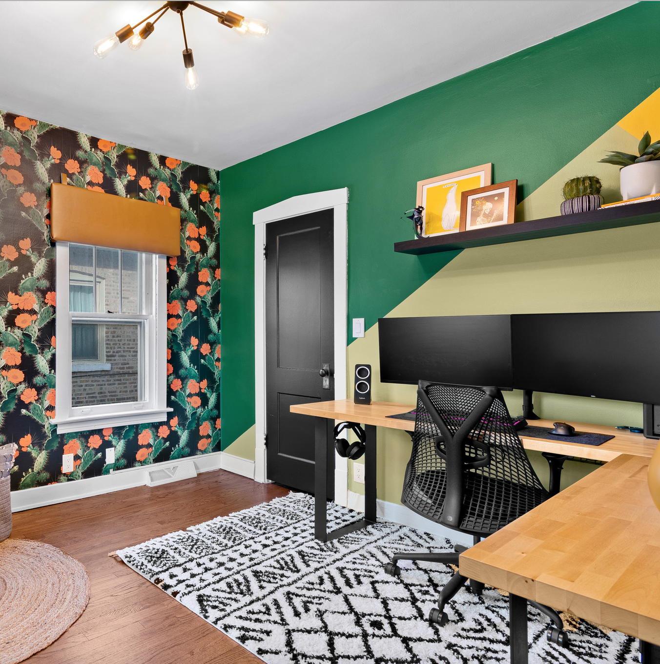
I can’t believe it’s week four of the One Room Challenge already. If you have been following along with me on IG stories you know I’ve been falling a little further behind each week. This was the week for making sure STUFF got done. My son-in-law is getting HUGE kudos for bringing the muscle this week and I am excited to show you the graphic design wall (THAT HE TOTALLY GETS CREDIT FOR) that we decided to add.
A big THANK YOU to Sherwin-Williams for providing the paint for this project. I have been a long time fan and if we have ever had a conversation about paint (it happens way more often than one might think) you have heard me waxing poetic about their Emerald Interior paint. Of course all opinions here are my own.
The wallpaper arrived and we were able to chose paint colors for the space. Off to their neighborhood Sherwin-Williams we went.
Choosing paint color (SW-Kale Green)
With the wallpaper in hand the clients (ahem.. my daughter and her hubby) were rethinking the dark grey we originally had planned and decided instead on a bold green for the walls, As you can see my daughter loves a good green. The people at the store were very helpful and gave the couple several suggestions.
Sherwin-Willams Kale Green
Once the base color was chosen we needed to choose the other colors for the graphic design. We settled on SW Butterfield and SW Baby Bok Choy.
My SIL drew out a few designs on his computer and all three of us loved this one. So now it’s time to get started!
Steps for painting a graphic wall.
Choose the wall you wish to accent.
Fill in any holes and wipe the surface clean. We covered the wood floors with paper.
Using your favorite painter’s tape, tape off the wall with your design. We used a ruler to make sure the lines were straight and crisp. Be sure to press the tape firmly against the wall smoothing out any bumps.
Begin with your base color (ours is SW-Kale Green) We are using Sherwin-Williams Emerald Interior paint which includes a primer so no priming was necessary. Let dry overnight. Tape off the reminder of the design. Repeat step three.
Apply a second coat if needed. Once paint has dried gently remove the tape.
Use a small brush for any touch ups or where any paint may have bled through your tape.
Stand back and admire!
Getting ready to paint with Sherwin-Williams Emerald Interior paint.
Taping off the graphic design.
Adding tape for second color.
SW Butterfield with SW Kale Green
We also painted the wood door SW Iron Ore.
And for the final reveal:
Pin it!
A huge shout out to Linda Weinstein for making the challenge such an amazing event and Better Homes and Gardens for being this year’s Media sponsor. I can’t believe we are two SHORT weeks away from the final reveal! As always, be sure to head on over to the One Room Challenge BLOG to read up on all of the other incredible transformations. Both the Featured Designers and the Guest Participants. You won’t believe all of the creativity busting out of their rooms!
Be sure to follow along on my Instagram this week as I hang the wallpaper and work on finishing touches.
Until next time,
xx
-Libbie


